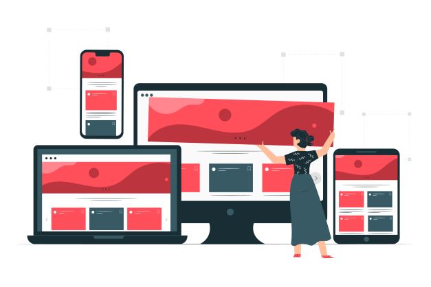
n the digital age we live in, web design has become an essential part of any business or online project. And with the constant growth in the use of mobile devices, it is crucial to ensure that websites adapt to different screen sizes and devices. This is where responsive web design comes into play. In this article, we will explore in detail what responsive web design is and how it can improve user experience on the web.
What is responsive web design?
Responsive web design, also known as responsive design, refers to an approach to web design and development that seeks to create sites that automatically adapt and respond to different devices and screen sizes. Rather than creating separate versions of the website for each type of device, responsive web design uses techniques and technologies such as HTML5, CSS and JavaScript to seamlessly adapt the look and feel of the site.
Responsive web design takes care of recognizing the needs of users according to the device they use to navigate. The key to this approach lies in the ability of responsive web design to detect the characteristics of the device and adjust the layout and page elements accordingly. This means that a responsively designed website will look and feel different depending on the device used, whether it is a desktop computer, tablet or cell phone. Elements such as image size, navigation layout and content positioning are optimized to provide an optimal user experience on each device.
Benefits of responsive web design
Improved user experience: By adapting to different devices, responsive web design ensures a consistent and pleasant user experience, regardless of the device used to access the site. This reduces the need for horizontal scrolling or zooming, making it easier to navigate and read content.
Better performance in search engines: Search engines, such as Google, favor responsive websites, as they offer a more satisfying experience to users. This can result in higher rankings in search results and greater online visibility.
Time and cost savings: Instead of creating multiple versions of the website for different devices, responsive web design allows for efficient development and easier maintenance. This reduces costs and time spent managing multiple websites.
Adaptability to future devices: With the constant evolution of devices and technologies, responsive web design provides flexibility to adapt to future devices and screens without requiring drastic changes in website design.
There is a great variety of screen sizes, and screen sizes are constantly changing, so it is important that the content of your website can be adapted to any screen size.
Here, we will explain the basics of responsive design so that you can use them and your users will not miss anything and will enjoy browsing your website.
Basic concepts of responsive web design
Configure the graphic window
In responsive web design, the configuration of the graphic window, also known as viewport, is a fundamental aspect to achieve a correct adaptation of the website to different devices and screen sizes. The configuration of the viewport is done through a meta tag in the HTML code of the page.
Here are the basic steps for setting up the viewport in responsive web design:
- Meta viewport tag:
In the header of the HTML document, you must include the following meta tag to specify the configuration of the viewport:
This tag tells the browser how to adjust the content according to the device width and sets the initial scaling level. The value "width=device-width" indicates that the width of the graphic window should be equal to the device width. The value "initial-scale=1.0" sets the initial scaling level to 1, which means that the content will be displayed without any scaling applied.
- Additional options:
In addition to the basic values mentioned above, there are other options you can use in the meta viewport tag to fine-tune the layout adaptation, for example:
- "minimum-scale" y "maximum-scale"These values allow you to set the minimum and maximum scale limits allowed for the content on the device.
- "user-scalable": If set to "no", the user's ability to zoom into the page content is disabled.
- "initial-scale"You can adjust this value according to your needs to control the initial scale of the content.
It is important to note that the options and their values may vary depending on the specific needs of your design and compatibility guidelines with different devices.
- Tests and adjustments:
Once you have set up the meta viewport tag, it is advisable to test on various devices and screen sizes to ensure that the layout will adapt correctly. You can use web development tools, device emulators or simply test the site on different real devices to ensure a consistent and pleasant user experience.
Adapt the content
Users are used to moving around websites vertically, they hardly ever scroll horizontally, so forcing them to scroll horizontally or zoom out to see the whole page can be a bad experience for your user.
When developing a mobile website with a viewport meta tag, it is easy to create content that does not quite fit within the specified viewport. Therefore, remember to adjust the content to fit the width of the graphic windowThe user does not need to scroll horizontally.
Take care of the images
In responsive web design, resizing images is essential for them to adapt correctly to different devices and screen sizes. There are several ways to achieve this:
- CSS with percentages or relative units:
You can use CSS (Cascading Style Sheets) which is a style sheet language used to describe the appearance and formatting of an HTML document to adjust the size of images using percentages or relative units instead of absolute values. For example, instead of setting a fixed width in pixels, you can use the percentage of the width of the parent container:
img {
  width: 100%;
  height: auto;
}
The above code states that the image should occupy 100% of the width of the parent container and the height will be automatically adjusted to maintain the original proportion of the image.
- max-width" label:
Another common way to adjust the size of images in responsive web design is to use the CSS property "max-width". By setting a maximum value for the image width, the image will automatically adjust to not exceed that size, maintaining the original aspect ratio:
img {
  max-width: 100%;
  height: auto;
}- Media queries:
You can also use media queries in your CSS to set different image sizes according to the width of the viewport or device. For example, you can define different styles for images on smaller screens:
img {
  max-width: 100%;
  height: auto;
}

@media (max-width: 768px) {
  img {
    max-width: 50%;
  }
}
In the above code, images will have a maximum width of 100% in general, but when the screen has a maximum width of 768 pixels, images will be reduced to 50% of their original width.
- Picture" tag and "srcset" attribute":
The "picture" tag and the "srcset" attribute allow providing different versions of an image for different screen sizes. This ensures that the appropriate image is loaded according to the user's device. For example:
<picture>
  <source srcset="image-large.jpg" media="(min-width: 1024px)">
  <source srcset="image-medium.jpg" media="(min-width: 768px)">
  <img src="image-small.jpg" alt="Image" />
</picture>
In the example above, different versions of the image are provided for large, medium and small screens. The browser will automatically select the appropriate image according to the screen size.
These are some of the common techniques used to resize images in responsive web design. You can combine these techniques according to your specific needs and the complexity of your design to achieve a proper adaptation of images on different devices and screens.
Flexible grid design
The dimensions and screen width in pixels of the CSS vary between devices, so the content should not depend on a window width.
Modern CSS design techniques such as Flexbox, Grid Layout and Multicol make it easy to create these flexible grids.to make the content fit the different window sizes.
We will tell you briefly how each one works:
- Flexbox
This design method is perfect for when you have a set of elements of different sizes and you would like them to fit in a row or more.
In a responsive design, you can use Flexbox to display elements in a single row or in multiple rows as the available space decreases.
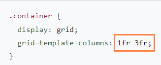
- CSS grid layout
This type of layout allows you to easily create flexible grids. You can use the grid layout and the "fr", which represents a part of the available space in the container.
The grid can also be used to create regular layouts, with as many elements as will fit. The number of available tracks will be reduced as the screen size is reduced.
- Multi-column design
For certain types of layouts, you can use a multi-column layout (Multicol), with which you can create several responsive columns with the property of "column-width".
Improve responsiveness with media consulting
Surely at some point you will need to make more extensive changes in your design to allow adjustments on screens of an unusual size, where the techniques we have just explained will not work for you.
Media inquiries or media queries are simple filters that can be applied to CSS styles. They make it easy to change the style according to the type of device on which the content will be viewed.
To provide different styles, you must target an output type in order to include the print styles as follows:

For responsive web design, you should consult the device characteristics to provide a different layout for smaller screens, or when you detect that your user is using a touch screen.
Media query based on the size of the graphics window
The media query allows you to create a responsive experience where specific styles are applied to any screen size. The "feature" you want to detect is the screen size, with which you can test the following:
- width ( min-width max-width )
- height ( min-height max-height )
- orientation
- aspect-ratio
All of these "features" have excellent cross-browser compatibility; for more details, including browser support information, you should consult the width, height, orientation and aspect ratio at MDN (Mozilla Developer Network) is a web platform that provides extensive documentation, resources and guidance for web developers, including responsive web design. It is a widely used and trusted reference in the web development community.
Media query based on device capacity
There are thousands of devices available on the market. With some newer additions to the media query specification, you can test "features" such as the type of pointer used to interact with the device and whether the user can scroll over items.
- hover
- pointer
- any-hover
- any-pointer
These newer features are well supported in all modern browsers.
Using any-hover and any-pointer
The functions of "any-hover" y "any-pointer" check if the user has the ability to hover the mouse over an element. Be careful when using them, as your user may feel compelled to use the mouse when using the touch screen.
How to choose breakpoints
Breakpoints are the points at which design changes are applied to adjust to different screen width ranges. Here are some guidelines to help you choose breakpoints in responsive web design:
- Analyze your target audience: Understanding who your website is targeting and how they typically access it is essential to determining the right breakpoints. Examine usage statistics, such as the most common screen size among your users or the most commonly used device dimensions, to identify key breakpoints.
- Consider the most popular devices: Although the variety of devices is wide, there are some screen sizes that are more common and widely used. For example, popular breakpoints tend to be around 320px (small mobile devices), 768px (tablets) and 1024px (desktop screens).
- Think about the user experience: Breakpoints should allow for a smooth transition and ensure an optimal user experience at every breakpoint. Consider how your design will look and function on each screen size, and choose breakpoints that allow for smooth adaptation without compromising readability, usability and aesthetics.
- Uses media queries and viewport data: Media queries are the main tool for setting breakpoints in CSS. You can use the media query feature to apply specific styles to different screen sizes. In addition, the viewport settings can also influence the breakpoints, as you can adjust the initial scale and the minimum and maximum scalability limits to adapt the layout.
- Performs tests and adjustments: It is important to test on different devices and screen sizes to verify that the chosen breakpoints work properly. Use web development tools, emulators or test on real devices to observe how your design adapts at each breakpoint and make adjustments as needed.
Optimizes text for reading
Classic readability theory suggests that an ideal column should contain 70 to 80 characters per line (approximately 8 to 10 words in English). Therefore, whenever the width of a block of text exceeds 10 words, consider adding an breakpoint.
Avoid hiding content
Be careful when choosing which content to hide or show based on the size of the screen. Don't hide content simply because it doesn't fit on the screen. Screen size is not an indicator of what a user may want to see.
- Chrome DevToolsOnce you have configured your media queries, you will be able to breakpointsyou will want to see how your site looks. Remember that you can change the size of your browser window to enable breakpoints, but Chrome DevTools has a built-in feature that makes it easy to see how a page looks at different breakpoints.
To view your page in different breakpoints:
- Open DevTools and then enable device mode. It will open in responsive mode by default.
- To view your media queries, open the device mode menu and select "Show media queries" to display your media queries. breakpoints as colored bars on your page.
- Click on one of the bars to view your page.
- Right-click on a bar to jump to the media query definition.
Responsive web design is an essential practice in website creation today. By adapting to different devices and screens, it ensures a consistent and satisfying user experience. The benefits of this approach include improved search engine rankings, development efficiency and adaptability to future technologies. By opting for responsive web design, you can ensure that your website is prepared for the ever-changing digital landscape.
If you want to learn more about how to optimize your website we invite you to visit our blog and read the articles of your interest. At ClickPanda we support and accompany small and medium enterprises, entrepreneurs and businesses in their digital transformation and growth, for this we create tools that facilitate their work, with which they achieve their goals and fulfill their dreams. Do not hesitate to contact If you have any questions or would like more information about our products, services or plans, please do not hesitate to contact us.