Introduction
Choosing the right colors for your website is not only a matter of aesthetics, but also a key strategy to improve the user experience and convey your brand values. Colors have a direct emotional impact on people, and the right choice can influence trust, interaction and conversions on your website.
In this article, we'll provide you with a practical guide on how to choose the ideal colors for your website. You'll discover how a well-thought-out palette can help you create a more engaging and professional experience, and how to align it with your brand's goals and your users' expectations.
Table of Contents
1. Understand the psychology of color
What it is: Each color can generate an emotional response in users. For example, blue is often associated with confidence and professionalism, while red is linked with urgency or passion.
Why it is important: Understanding how colors affect users' emotions will help you choose a palette that communicates the right message and creates the atmosphere you want.
Example: If your business is related to health, green is an excellent choice because it conveys wellness and nature.
To learn more about the current trends in web design, we invite you to read our latest article about the Web design trends for 2025, where we explore how clean interfaces, clear navigation and visible actions improve user experience and increase conversion.
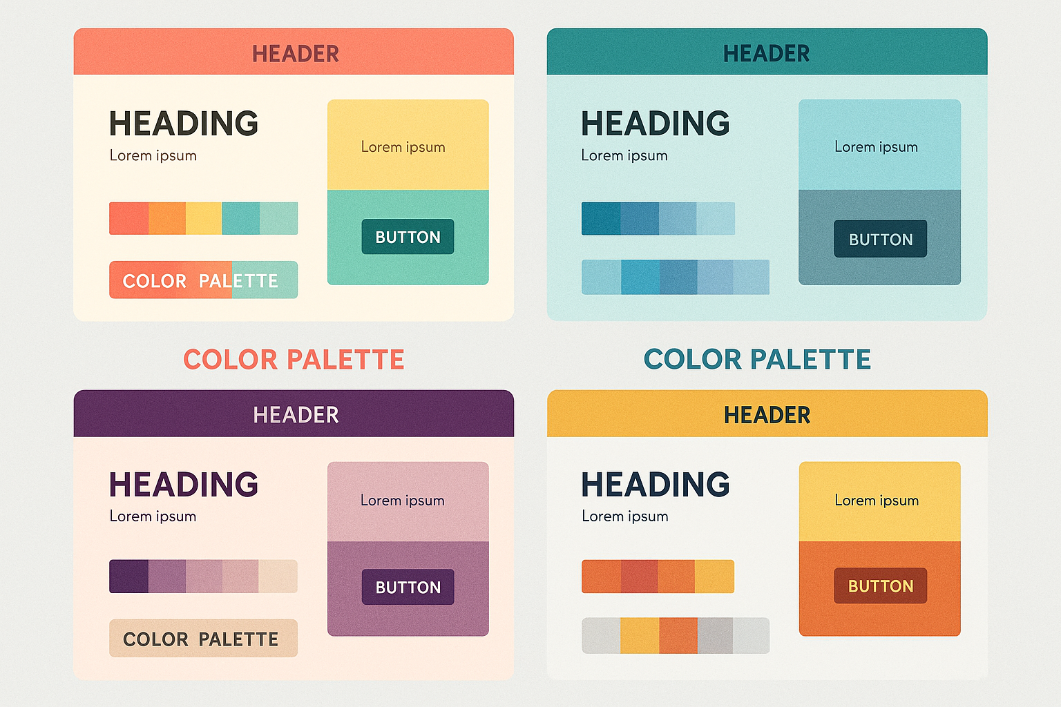
2. Keep it simple: use 2 to 3 main colors.
What it is: Use between 2 and 3 main colors on your website so as not to overwhelm users with an overly complex palette.
Why it is important: A site with too many colors can look cluttered and make navigation difficult. It is best to focus on a simple palette and use variations to add depth and contrast.
Example: Many websites use white or light gray as a background color, with a primary color and an accent color for buttons or key elements on the page.
3. Align colors with your brand
What it is: The colors of your website should be consistent with your brand's visual identity. If you already have a logo with specific colors, be sure to integrate them into your web design.
Why it is important: Color consistency across all elements of your brand (website, social media, promotional materials) helps create a strong and recognizable brand image.
Example: If your brand already uses warm colors like orange and red in its logo, you can continue with this palette to give your website a coherent identity.

4. Contrasts colors to improve readability
What it is: The contrast between text and background is crucial for users to easily read the information on your site.
Why it is important: Good contrast makes content readable and improves the user experience. It is also essential for your site to comply with accessibility regulations.
Example: If the background of your site is dark, be sure to use white or light text for better readability. Avoid using text colors that blend with the background, such as light gray on white.
5. Considers accessibility and vision of all users
What it is: Web accessibility refers to making sure your site is usable for people with visual impairments or difficulties perceiving certain colors.
Why it is important: When selecting colors, make sure that people with color blindness or visual impairments can navigate and read your site without difficulty.
Example: Avoid color combinations such as red and green (which are difficult to distinguish for people with color blindness) and use tools such as Contrast Checker to check color contrast.
6. Test the color palette with your users
What it is: Before finalizing the color palette, conduct user testing to get feedback on how they perceive the colors and if they are comfortable with the visual experience.
Why it is important: User feedback can help you identify areas of design improvement and make adjustments before your site is officially published.
Example: If users feel that a call-to-action (CTA) color does not stand out enough, you can modify the palette to make the button more visible and attractive.
Are you ready to enhance your website design with the right colors? ClickPanda offers you customized web design solutions that will help you create an attractive and functional website, adapted to your brand.
Conclusion:
Choosing the right color palette for your website is critical to creating a consistent and professional user experience. Remember to consider color psychology, accessibility and your brand identity to select colors that not only look good, but also effectively communicate your business values. With a well thought out color palette, your website will not only be visually appealing, but also functional and easy to navigate.