Introduction
Have you ever browsed a website on your cell phone and, although it looked "tailored", you found it uncomfortable to use? That's the problem with many businesses today: their pages just fit the screen size, but don't offer a truly optimized experience.
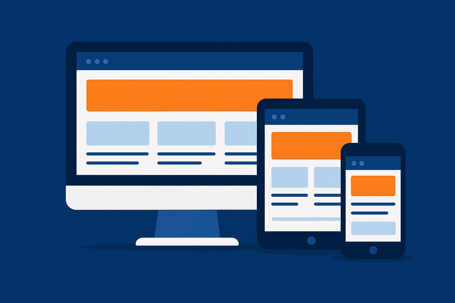
In a world where more than 70% of users access the Internet from mobile devices, it is no longer enough to have a responsive design. You need a advanced responsive web designcapable of delivering fluidity, speed and seamless usability regardless of device, browser or user context.
Advanced responsive design not only impacts the browsing experience, it is also key for the SEO, customer trust and conversion to sales. This is where ClickPanda comes in: your technological partner to create modern, fast and strategically designed websites that will conquer on any screen.
Table of Contents
What is advanced responsive design?
The adaptive design only adjusts the appearance of the site to different screen sizes. However, the advanced responsive design goes further:
Prioritizes the user experience on each device.
Adjust design, navigation and content elements depending on the context.
Guarantees accessibility, speed and aestheticscreating a uniform but optimized experience.
A user accessing from a cell phone does not expect the same as one from a computer; advanced design understands these differences and responds with precision.
Best practices for responsive design in 2025
Use of grids and flexible layouts
The key is structures that flow without breaking on small or very large screens.Images optimized for different screens
Images that load fast on mobile without losing quality on high resolution screens.Microinteractions and simplified mobile navigation
Intuitive menus, large and accessible buttons, and animations to guide the experience.Loading speed as a priority
A slow site makes the user leave; Google penalizes it and your sales go down.
Difference between "adaptive" and "advanced": a practical example
Imagine visiting an online store from your cell phone.
Basic adaptable design: you see the same elements of the desktop site, just smaller. The menu is hidden, images take a long time to load and typing in the forms is complicated.
Advanced responsive design: the site recognizes your device, prioritizes the browser, optimizes images for your mobile network, adjusts buttons for thumb use and simplifies the checkout process.
The second case not only improves the user experiencebut it also multiplies the chances that you will finalize the purchase.
Why advanced responsive design is key for SEO?
Google uses indexing mobile-firstIn other words, analyze the mobile version of your website first before the desktop version.
If your site doesn't load fast on mobile → your ranking goes down.
If navigation is difficult → users abandon and Google interprets low relevance.
If the images are not optimized → your speed is penalized.
An advanced responsive design becomes a decisive factor for appearing in the first search results and outperform the competition.
Trends in advanced responsive design.
Mobile-first design as standardThe desktop used to be designed for the desktop, now the priority is the cell phone.
Intelligent dark modeDark interfaces: More and more users prefer dark interfaces, and sites should automatically offer that option.
Fluid fontsText that adjusts precisely to each screen without losing readability.
Modular componentselements that are dynamically reorganized according to the width of the screen.
Inclusive experienceaccessibility for people with visual or motor disabilities.

Common errors in "supposedly responsive" sites
Menus that do not work on touch screens.
Heavy images that slow down mobile loading.
Buttons so small that it is impossible to touch them with your finger.
Endless forms with no optimization for mobile keyboard.
Elements that "break" on tablets or large screens.
Avoiding these mistakes is what differentiates an average site from a professional web site with advanced design.
Actual use cases
Online storesSimplifying mobile shopping increases conversions by up to 40%.
Digital mediaLonger dwell time thanks to readable texts and dynamic menus.
Local business: visible "Call now" buttons on mobile facilitate direct contacts.
Online storesSimplifying mobile shopping increases up to 40% conversions. And if you think that setting up your ecommerce is complicated, find out how to do it quickly in our blog. Online store in a single day? It's possible!
How to measure if your site is really responsive
Google Mobile-Friendly Testtells you if your web site passes the basic standards.
PageSpeed Insights: measures loading speed and optimization.
Test on multiple devicesSimulates navigation on cell phones, tablets and computers.
Metrics analysis in Google Analytics 4: check bounce rate and conversions on mobile.
Basic vs Advanced Responsive Design with ClickPanda
| Feature | Basic design | Advanced responsive design (ClickPanda) |
|---|---|---|
| Screen adjustment | Simple to adapt | Optimized experience on every device |
| Speed | Can be slow on mobile | Fast and optimized loading |
| Navigation | Impractical menus | Simplified and intuitive navigation |
| SEO | Limited positioning | Better ranking in Google |
| Conversion | Download | Registration: convert visitors into customers |
Turn your site into a modern and optimized experience with an advanced responsive design.
Start today with ClickPanda.
Conclusion
The advanced responsive design is much more than aesthetics: it is the foundation of usability, trust and online sales. In such a competitive market, every screen represents a business opportunity, and only those who offer optimized experiences stand out.
With ClickPanda you have the ideal ally to transform your website into a powerful tool that shines on any device.
Every screen is an opportunity to win over your customers. Do it with ClickPanda.